G. Label by goop
Brand Identity Refresh
2024
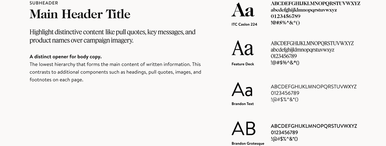
Typography and secondary color system strategy and execution.
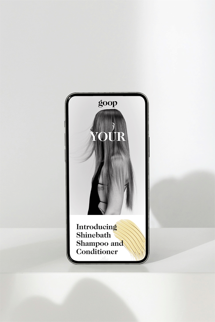
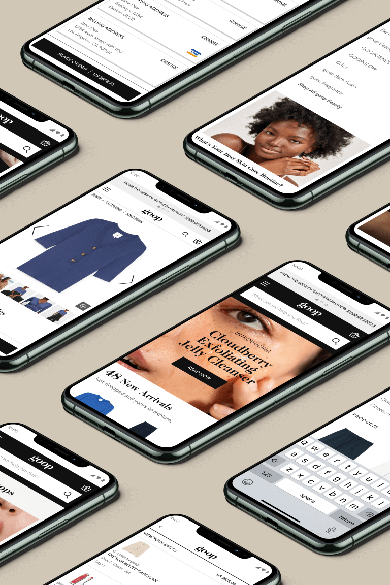
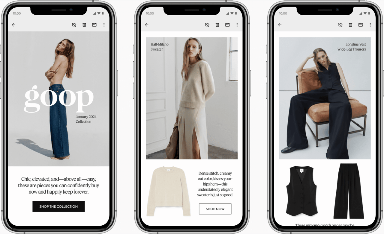
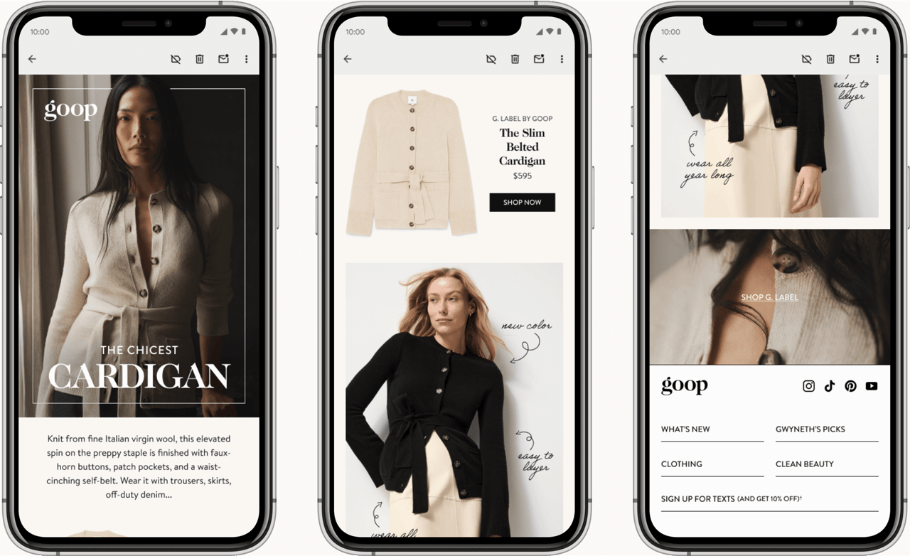
Emails and hero assets concept and direction.
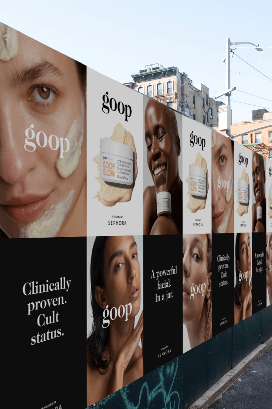
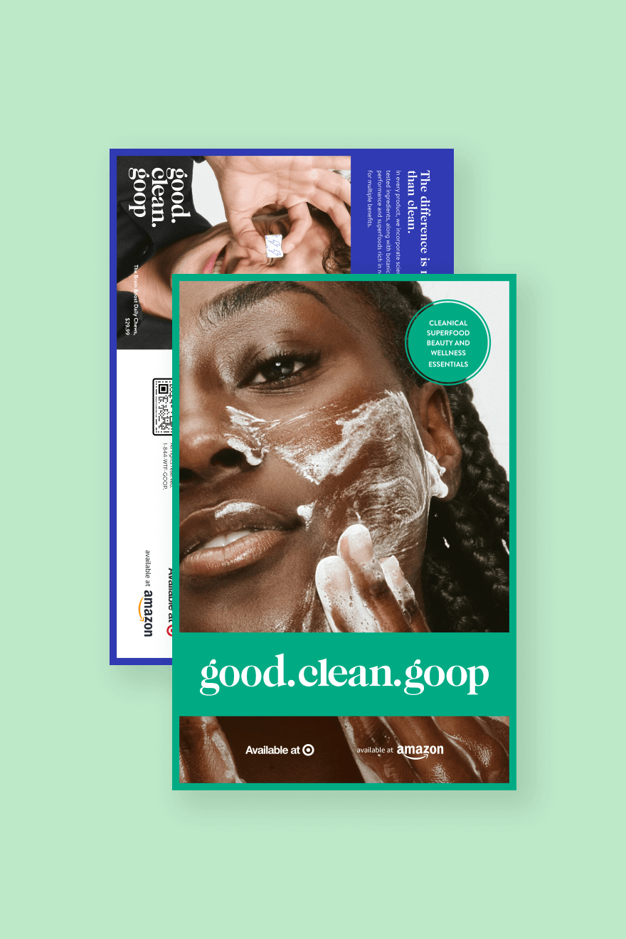
To support the fashion brand’s revitalization of the photography and marketing approach, new graphical treatments and design layouts are crucial building blocks for a successful brand refresh. A signature aesthetic allows these functions to align in bringing a fresh perspective to the brand that’s both relevant and engaging.
Based on market research, primary focus is centered around utilizing “goop” over “G. Label” to establish immediate brand recognition with the “G.” symbol incorporated into supporting assets to be directly perceived intuitively. An improved secondary color palette of sophisticated hues with a greater variation from light to dark serves to add subtle visual depth and richness to design deliverables without compromising the brand’s integrity and cohesion. A new typeface and defined hierarchy elevates the message and brings more context to the storytelling. Hero assets with typography incorporated harmoniously into imagery and emails refined to their most impactful state are established to provide direction for future design inspiration and execution.


More Projects