goop
UX/UI Product Design
2019-2022
User experience research, wireframe, and prototypes.
User interface design and execution across site pages and user journeys including homepage, landing pages, site navigation, search, product detail pages, and checkout flow.
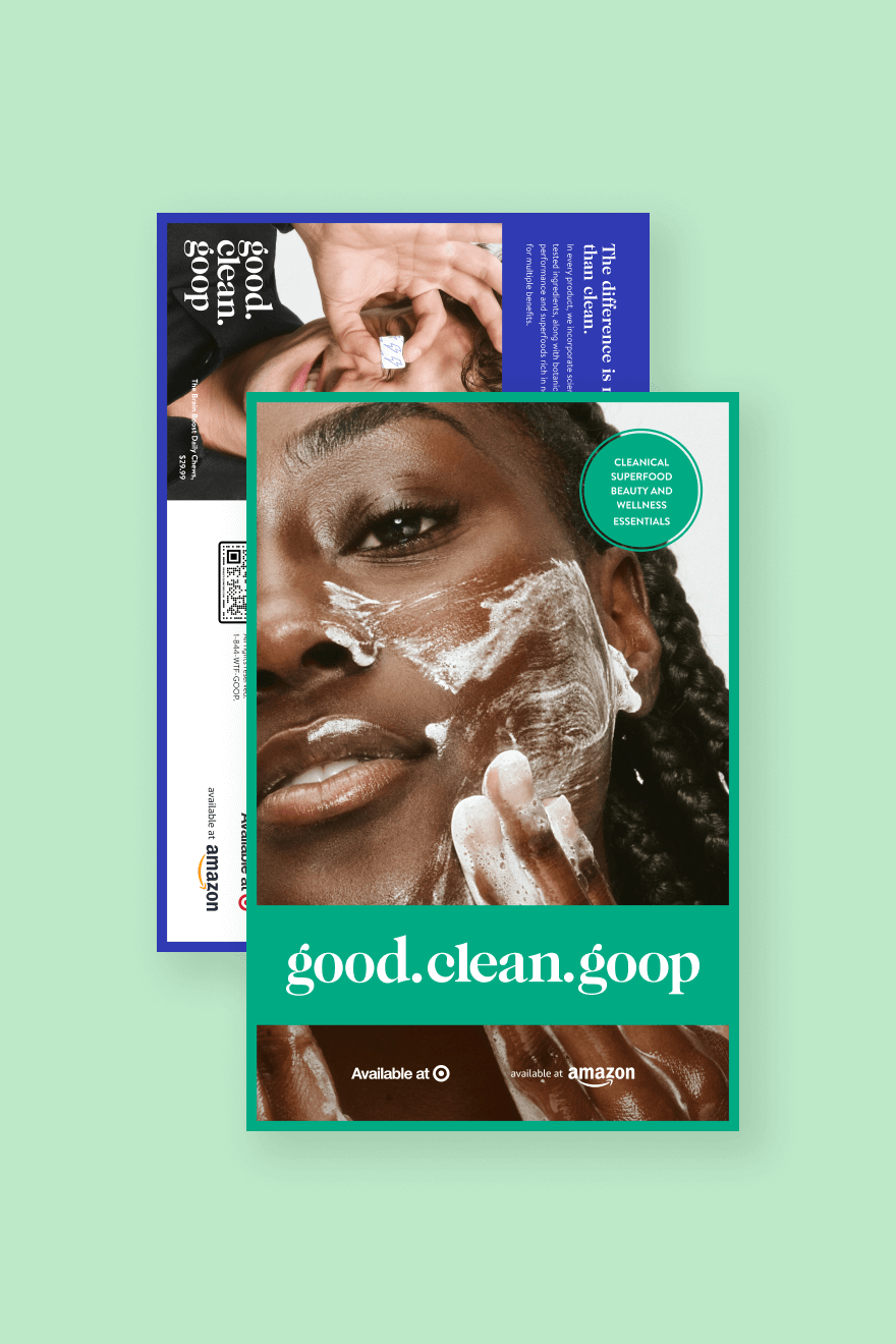
goop was established in 2008 as a weekly content newsletter with a homespun approach. Over the course of a few years, it expanded into e-commerce and gained recognition in the fashion, beauty, and wellness industries. The site was in need of comprehensive redesign and restructuring to effectively convey the brand's extensive reach across all verticals while enabling users to navigate the content intuitively and efficiently.


Homepage

The Challenge
Redesign the homepage to align on the company’s business goals which pivoted to scaling revenue through ecommerce. The homepage originally showcased goop’s editorial reach, featuring daily stories across 5 verticals with minimal emphasis to purchase anything. An elevated homepage with aspirational content was the first and most crucial user experience needed to drive traffic through the purchase funnel while still honoring the brand’s roots as a leading source in digital lifestyle publication.
The strategy
I wanted users to enter the site and immediately get a sense of the breadth of products and content goop has to offer. Everything needed to be summarized in a concise way with a clear point of view to introduce users to the brand without them feeling overwhelmed and experiencing decision fatigue.
The solution
My approach was to showcase a diverse collection of shoppable product carousels and category components that were prioritized in order of the highest performance metrics. Having “New Arrivals” near the top gave users an immediate exposure to products from a variety of verticals while “Featured Shops” directly below it started narrowing the user journey down to specific interests. A variety of streamlined entrance points increased the chance to capture user intrigue and higher engagement in each respective funnel.
To differentiate the editorial, I went with a contextual commerce approach, leveraging the brand’s lifestyle publications with curated products relevant to the story. This not only added depth to the stories but increased user conversion from reader to shopper.
Main Navigation
The Challenge
Update the site navigation mapping and overall structure to comprehensively represent all of the brand’s content in an organized manner. The main navigation supported goop’s publication content with simple categories like “Go”, “Be”, “Do”, “See”, “Make”. But with the increasing amount of stories plus the integration of ecommerce, these category names became vague and the brand required an updated navigation structure that tailored to users who are not familiar with the brand. In addition, these categories were not able to accommodate certain verticals containing multi-brand and goop-owned products.
The strategy
A complete restructure was required to ensure a more intuitive main navigation where users can access both stories and products in a seamless manner. From a user-centric perspective, I wanted the language and content to be more straightforward in order to give the audience what they need, at the time they need it, and in the way they expect it.
The solution
I first defined all the categories and features on the goop site and outlined a basic information architecture for it. This determined how many levels were required for each vertical. The navigation design evolved into a multi-level experience on mobile where users have the option to filter down to three category levels for certain verticals. Each vertical had a more defined name and housed all its respective content for both reader and shopper cohorts. Expand and collapse capabilities enabled more control for the user and hero features were showcased as tile components in their respective vertical.
Search Suggestions
The Challenge
Based on key metrics, the search bar received high engagement rate despite the fact that it wasn’t the most prominent feature on the site’s main header. The objective was to bring this functionality to the forefront and elevate the search results experience prior to the advanced search results page. The goal was to enable users to find what they’re looking for quicker, with more accurate results, and without navigating them to a separate page experience.
The strategy
Visual placement and sizing was imperative to ensure the search bar was prioritized in terms of hierarchy and available where users expect it to be. From the second the search bar is active to when a result is selected, users should be fed intuitive content through the use of auto-suggestions partnered with multiple paths populating result options. No matter what search query is entered, the user should never hit a dead end.
The solution
Starting with the default view, I increased the size of the search bar component and placed it directly below the brand logo to improve visual hierarchy. The decision to change the main header background to the brand’s primary black added high contrast around the white form field, making it the most prominent feature upon entering the site. Upon clicking the search bar, the user is immediately introduced to a dropdown revealing a variety of discovery content based on their search history, popular keywords, and high performing products. Auto-suggestions kick in as soon as characters get entered into the form field. These get filtered down the more the search term is defined with results coming from breadcrumb links, specific brands, products, and editorials. In the event keywords are not found or misspelling occurs, content will still populate the dropdown as high performing products and popular search terms are recommended to the user.
Product Details Page
The Challenge
Explore a new and improved user experience to showcase product and provide enough engaging information to drive customers into the purchase funnel. The first design iteration had the page split into three columns with product details on the left side, product images in the center, and attributes on the right side. The separation of information from the call-to-action created a disconnect to the overall visual hierarchy. With so many components spanning across the entire page, the overloading of information above the fold distracted the user’s attention from effectively making the purchase.
The strategy
Enough information about the product was imperative to instill customer trust and confidence to make the purchase. From a user-centric perspective, they should receive all the information they need in a organized manner without having to navigate elsewhere on the site for additional sources. Visual hierarchy and content layout was revisited in conjunction with the principle of the inverted pyramid. I streamlined the user experience by uncovering information gradually, from the most important and demanded first, to more specific details revealed further down the page.
The solution
I restructured the page content into two columns, allowing all information to be organized on the right side with core details (ie. brand, product name, price, attributes) placed above the fold and product images showcased on the left side which could be viewed at a larger scale. All details below the call to action was organized into an accordion menu to provide enough content to engage the customer in a progressive manner while keeping the overall page experience clean and organized. This also allowed users to have full control over the content and decide what is important to them. An additional “Complete the Look” cross-sell was also integrated to add more relevance to the user experience. It enabled further discovery and a seamless purchase of featured products that were styled together in the on-figure images.
Checkout Flow
The Challenge
Streamline the user experience to allow for a more comprehensible and efficient progression through the checkout flow. While there were some general pitfalls that could potentially result in cart abandonment, the main challenges to overcome were account selection and creation, shopping cart functionality, form field usability and overall form design and checkout layout.
The strategy
A multi-faceted approach was integral to the success of the checkout experience to increase conversion rate and customer retention. Users should feel supported and guided with simple and clear instructions, visual cues, validation messages, and adaptive error messages from start to finish. Any nonessential and unwarranted form fields were eliminated to avoid overcrowding the page and overwhelming the user.
The solution
Many users refused to create an account simply to checkout so I dedicated a page at the beginning of the checkout flow with the option to checkout as a guest (with this call-to-action being the most prominent), create an account, or log in. Form fields were designed with clear language and symbols, indicating which were required to proceed further. As the user completed each individual form field, a green indicator validated their entry or a red indicator with an error message explained the specific issue that needed to be addressed. All information entered in previous steps remained accessible throughout the entire checkout flow in the form of an accordion menu, allowing users to go back and edit if necessary. In addition, the shopping cart interface was also present for users to review their order details and remove products if needed. The review and confirmation pages outlined all the information and details of the order which provided full transparency and instilled user confidence in their purchase decisions.
More Projects